
Nowadays, the internet has changed, also user behavior is also changing every day. Most people are used from mobiles, tablets, and smart TVs. That’s why we need to add features to mobile. People can see the website easily on mobile devices. To keep up with the fast-changing environment, the advantages of a responsive website have become a crucial part.
What is Responsive Web Design?
Responsive web design means a type of design system where each website has an automatic design for screen sizes. Here designer can pick any size and make a design for the particular devices. Generally, we know some common responsive sizes
For Desktop
1920×1080
1536×864
1366×768
For Mobile
360×800
390×844
393×873
For Tablet
768×1024
810×1080
820×1180
A designer, when making a website design they must fix it for those devices. But if you need any middle size from those sizes, custom can set and make a design for a particular design.
This way user can take the highest advantage, and the business owner can get the advantages of a responsive website that will be a key point of success.
Why is it Essential Today?
Now world-wide internet has a huge user there, most of are use mobile. And globally, traffic comes to almost 50% from mobile. So without mobile mobile-friendly design, any business can survive in the competitive world. Because advantages of a responsive website include better performance, a high conversion rate, lower maintenance costs, and high CTR.
Advantages of a Responsive Website
A responsive website design provides a great advantage for the user and, business owner. For example, in SEO, a better UI. In this competitive world Advantages of a Responsive Website
is the largest strength of.
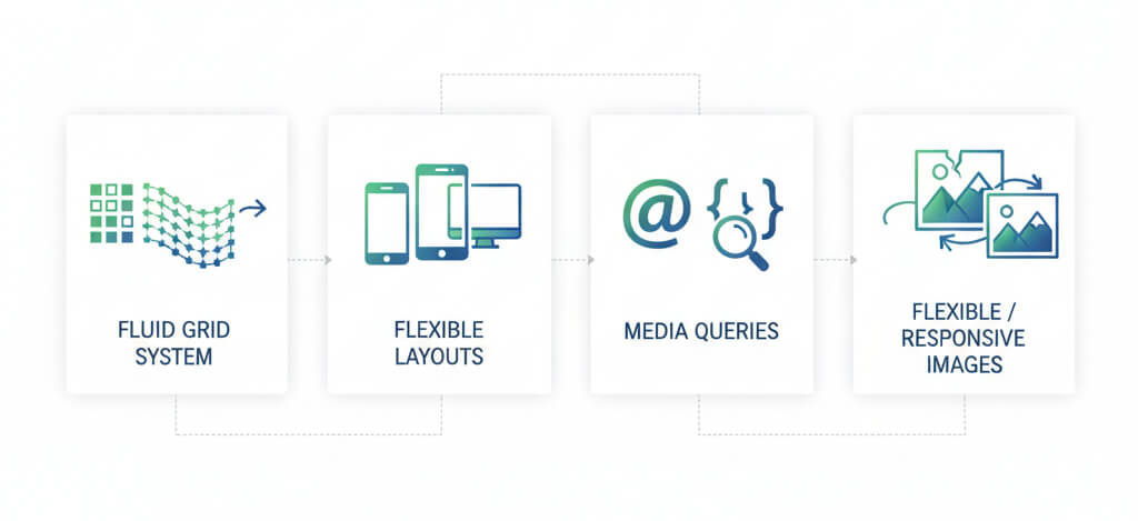
How Responsive Web Design Works (Core Principles)
Here, I’ll discuss the core principles of advantages of a responsive website. This is very important for a web designer. But anyone must have the knowledge about the technical term.
a) Fluid Grid System: This system is 100% layout-based, screen size. According to the size design is automatically adjusted.
b) Flexible Layouts: This system is very popular. This Flex layout can adjust the content very well. Automatically helps to adjust any devices.
c) Media Queries: As a developer, this term is my favourite. Using CSS media queries, we can design Specific screen sizes. You can apply different CSS styles depending on the user’s screen width.
d) Flexible / Responsive Images: For modern design, we’ve used srcset, sizes, picture element. This technique provides image-perfect responsiveness, that a part of advantages of a responsive website.
4. Why Responsive Web Design is Important (Major Benefits)
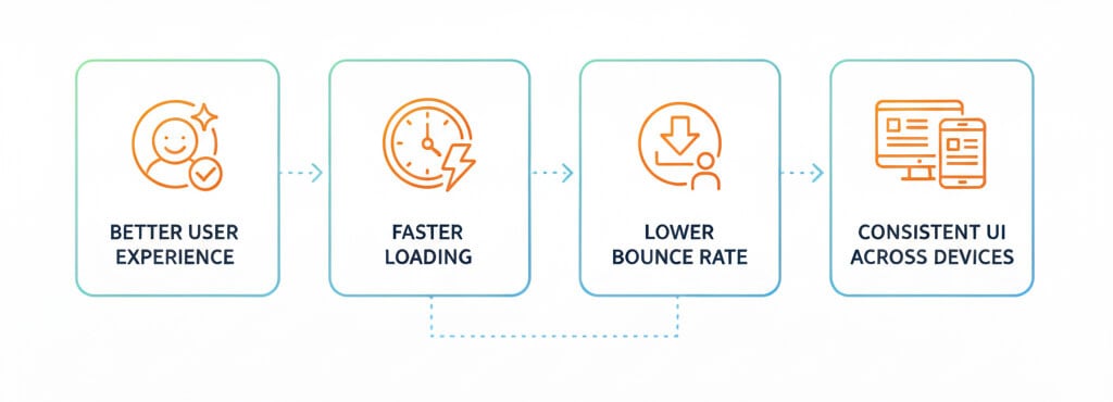
Better user experience
All responsive sites provide a smooth experience that works directly as advantages of a responsive website.
Faster Loading
If your website image and layout are optimized, then your customers will experience fast loading.
Lower bounce rate:
This is the most important thing that if any visitor comes to your website or any news or post, and the visitor sees that the website browsing is slow, no responsive design for mobile, then the user will move to another similar type website. That’s called bounded.
So every website owner tries to hold all visitors but here, definitely some of visitors will be bound but A good bounce rate is generally 40% or lower, but this can vary significantly depending on your industry and website type
Consistent UI across devices
Suppose you have a website and have multiple pages and If you design every page different design style, that could be another reason for occurring bounce. So keep in mind that every page design layout should be consistent.
The Eight Benefits of Responsive Web Design
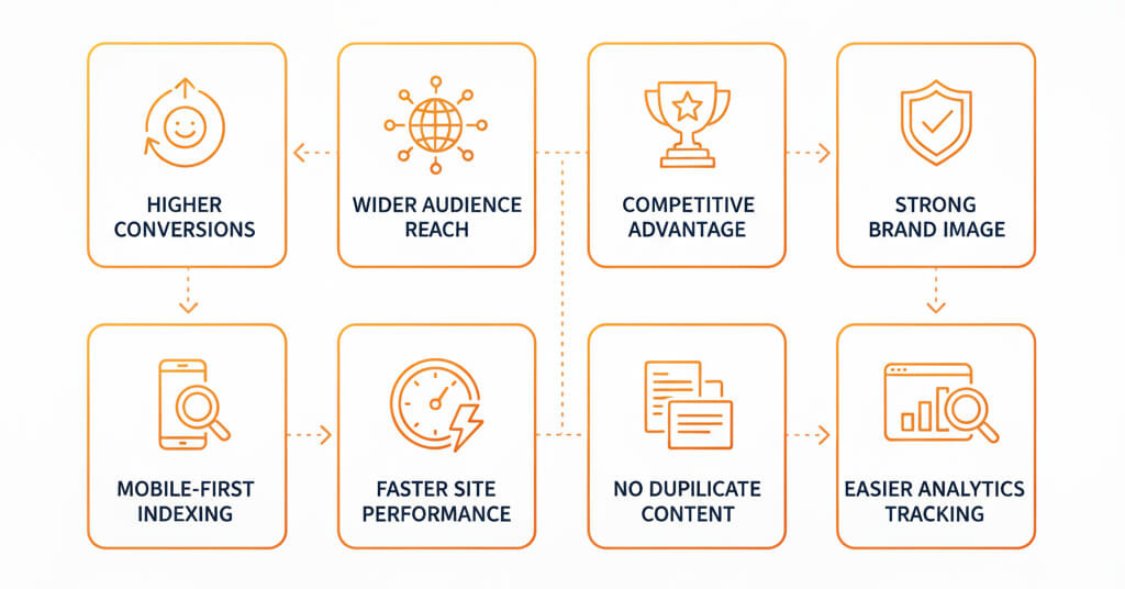
Higher conversions
If you ensure that your website design is fully responsive, 100% guarantee your website conversion rate will be increase.
Wider audience reach
In above I’ve mentioned almost in the internet, 50% of mobile phone users, but the rest of 50% have desktop, tablet, or smartTV users. For then you have to count them. So for them also need a responsive design.
Competitive advantage
You know this is a issue that’s why you came in the website that you currently you are currently reading. Because this is a major issue. So, maximum website owners don’t follow the proper responsive rule. If you do proper responsive design. So you will be one step ahead of your competitors.
Strong brand image
When designing any website, creating layout structure after that, what will happen? I need to upload images right? After uploading image most of the time I realized what a website I created. Like this time all credit goes to the image. It’s amazing right?
So if your website image displays your brand identity, definitely the website will be professional and responsive.
Mobile-first indexing
Do you know google always provides a rank for a fully responsive website? So when you make any website page or upload any blog post to your website. This time you need to index it for displaying to google search results. Here, google has a system every time or every blog post they will check that is your website have responsive or not. If they found the website does not follow mobile responsive rules that time Google can’t index your website.
Faster site performance
that’s means your site loading speed will be less than 3 seconds. In the current world, visitors are too fast. They expect a milliseconds loading speed. Most of developer’s are doing this task. Like some of mobile applications are performed with millisecond it’s has an ajax loading system in behind.
No duplicate content
Google algorithm is currently updated they always detects duplicate content. Like on YouTube platform if we upload same video youtube gives us copyright strikes. Similarly also has in article or content based platform.
Sometimes you can upload duplicate content on your blogging platform. Beside google also indexes your content but you can’t get rank on google. Because the existing content has already been ranked on google. So why do you think your duplicate content will be ranked on google. It has logic.
Easier analytics tracking
For this analytics tracking, you have to use google tracking tool like Google Analytics. It provides when your visitor comes in to your website also which country and city they are. On the other hand you can track how much time they spend on your blog. Also, too many parameters are in the analytics. For example, you can track bounce rate, gender, and device.
So using all those data you can make a decision which content goes well or not.
Best Practices for Responsive Design
If you make pure responsive site you have to follow some rules. That ensures your site perfectly performs for any devices. So first of all, from small device you have to start doing responsive then scale up to large devices.
Beside you will use responsive typography such as rem, em, viewport-based typography. This type of typography always fit for any device.
In your website you can use SVG as a icon here some people are used png icon. Png icon is good but when you upload 40/50 pics images on a single website that time your website gonna be very large. So for this time you can use SVG. It’s actually code code-based image.
Here you can you can unlimited icon for your site. This SVG has huge advantage as it is loading time very fast and it is always fit for any device. This way you can improve your site performance.
Most important part is here. When you make any website you must need images right? Do not upload any extension like jpg, png, or others. Here you will compress the image first from any compress website.
There are any compress image website available such as tinypng, ilovepdf like this. After compressing image you will convert your png image to webp format. WEBP format is basically google algorithm like very well.
WEBP is a modern format it you help to increase website speed.
As a developer when you are trying to build website don’t use only html and css for design your website. Here i’ll say must use Bootstrap and Tailwind CSS for your website. Those are the foundations for any website. These are called frameworks.
In framework already been set the gird, flex system perfectly.
So finally, if you use modern design, normal layout, optimize images, and responsive typography. Definitely the website runs very smoothly, and visitors can get an amazing experience from your website.
FAQ of Advantages of a Responsive Website
What is Responsive Web Design?
Responsive web design is a system that automatically fits any device screen. The important thing is maximum visitor are use mobile and tab devices that’s why every website needs responsive design. It provides the best experience for visitors.
What is the advantages of a responsive website
In every website need responsive site with proper SEO that decrease bounce rate. Also ensure good loading speed, and optimize images. That’s parameters will fastly boost your website.
How impact responsive design in SEO?
Google always use mobile-fast indexing so generally responsive design help to improve for ranking. There are no duplicate URL, loading speed less than 3s. Overall user experience is good. That’s very important for SEO.
Does responsive design eliminate the need for a separate mobile site?
YES!
What technologies are used to create a responsive website?
Responsive websites are built using—CSS – fluid and grid system, flexible layouts, optimized images, SVG, modern frameworks (Bootstrap, Tailwind css), and lazy loading, caching, and WebP/AVIF image formats for performance optimization.
Conclusion of advantages of a responsive website
Responsive web design is not just a design technique. It’s a for success any business. I’ve covered the benefit for advantages of a responsive website. This technique provides good conversion and good for SEO
If you need mobile-friendly, high-performing and you have to make mobile friendly web design. And if you are struggling with the responsive design you can contact with us. We are a professional, modern, fast-loading and conversion-focused responsive website. The end of advantages of a responsive website topic


